

Business signage does more than display a name. It helps people confirm they have reached the right place, understand where to go next, and form an impression before they speak with an employee. For businesses in Ottawa, Ontario, Studio Signs business signs provides an example of a full-service approach to custom signage, vehicle wraps, large-format printing, design, in-house production, CNC work, welding, and installation. Studio Signs has worked in the Ottawa area for more than 30 years, making its services relevant to organizations planning signs across a property or brand.
A clear sign system can make an unfamiliar location feel easier to use. From the first view from the road through check-in, shopping, or exiting, each sign should answer a practical customer question quickly.
Why Signage Still Shapes Customer Decisions
Signs are often a customer's first physical interaction with a business. They can help someone find a location, recognize what the business offers, and decide whether to enter. A 2026 consumer survey found that 84 percent of U.S. adults said signage affects their purchase decisions, while 42 percent said they had been unable to locate a business because its sign was difficult to read. The findings reinforce the value of clear, visible information at the point where customers make decisions.
Start With the Customer's Point of View
Plan signs around what a first-time visitor needs to know before reaching the door. Walk the property from the street, parking area, sidewalk, lobby, and waiting areas. At each point, ask whether a visitor can easily identify the business, locate parking, find the correct entrance, and reach reception, checkout, or a service counter.
This review often reveals gaps that are easy to miss from inside the business. A sign that looks adequate from a doorway may be difficult to see from a moving vehicle or across a shared parking lot.
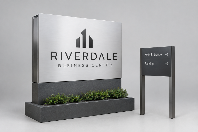
Build a Simple Signage Hierarchy
Every sign should have a clear job. When too many messages compete for attention, visitors may need to stop and decode information instead of moving naturally through the space.
- Identification signs confirm the business name and location.
- Directional signs lead people to parking, entrances, elevators, rooms, or service areas.
- Information signs communicate hours, instructions, policies, menus, or safety details.
- Promotional signs highlight offers, events, products, or seasonal messages.
Make Readability the First Design Test
Readable signs use concise wording, suitable letter sizes, clean spacing, and strong contrast between text and background. Decorative type may suit a logo, but directional signs usually work better with straightforward lettering that can be understood quickly.
- Can the main message be understood in a few seconds?
- Can drivers read it without slowing or becoming distracted?
- Does it stand out from nearby buildings, displays, and visual clutter?
- Is it still legible in glare, shade, rain, or low light?
Test a proposed design at its actual viewing distance in daylight and after dark. A sign that looks balanced on a computer screen can become hard to read once it is installed outdoors.
Match the Sign Type to the Location
The right format depends on viewing distance, traffic speed, building layout, lighting, weather exposure, and local requirements. Building-mounted signs help identify a storefront or office. Freestanding signs can help properties set back from the road. Window graphics support street-level visibility, while lobby displays establish a clear arrival point inside.
Directional signs are useful in parking areas, corridors, and multi-tenant buildings. Vehicle graphics can extend brand recognition for businesses that travel to customer locations. Large-format displays may suit campaigns, events, or temporary promotions when their message remains focused.
Use Brand Elements Without Sacrificing Clarity
Color, logos, shapes, and materials can make signs recognizable, but branding should not interfere with legibility. A low-contrast brand palette may need a lighter or darker background for text. Create a basic sign standard that defines approved logo treatments, colors, fonts, spacing, and messaging so exterior signs, interior graphics, vehicles, and printed materials feel connected.
Plan for Accessibility and Inclusive Wayfinding
Accessibility should be considered at the beginning of the design process. Clear contrast, consistent placement, logical directions, and tactile details can make a location easier to navigate for more people. In the United States, the ADA Standards for Accessible Design include requirements for certain signs, including tactile characters, Braille, contrast, and installation location.
Requirements vary by jurisdiction and building type, so businesses should confirm applicable building, accessibility, landlord, and municipal rules before production. Accessible wayfinding also helps visitors who are carrying items, reading from a distance, or entering an unfamiliar building.
Consider Lighting, Materials, and Weather
Outdoor signs must withstand conditions such as sunlight, moisture, wind, temperature changes, and regular cleaning. Reflective surfaces, raised lettering, illumination, and durable finishes can affect visibility and maintenance. Choose materials based on expected lifespan and exposure, not appearance alone. Ask whether the sign will still look professional after several seasons outdoors.
Connect Signs to the Full Customer Journey
A customer may encounter several signs during one visit: street-level identification, driveway or parking direction, entrance confirmation, reception guidance, interior navigation, and checkout or exit information. A medical office, for example, may use the same colors and typography from its roadside sign through its reception desk, hallway markers, and room identifiers. Consistency helps visitors know they are still on the right path.
A Practical Signage Planning Checklist
- Define the purpose and audience for every sign.
- Identify viewing distance, available space, and lighting conditions.
- Use concise wording, readable type, and strong contrast.
- Check zoning, property, landlord, permit, and accessibility requirements.
- Match materials to indoor or outdoor exposure.
- Proof wording, colors, measurements, and installation details before production.
Common Questions About Business Signage
How Much Text Should a Business Sign Include?
It depends on the sign's purpose and viewing distance. Identification signs should remain brief, while interior information signs can carry more detail because people have more time to read them.
What Makes a Sign Easy to Read?
Simple wording, adequate letter size, uncluttered spacing, strong contrast, and enough viewing time all support readability.
Should Every Sign Use the Same Design?
Signs should feel related without being identical. Exterior, interior, directional, and promotional signs can serve different functions while sharing core brand elements.
When Should a Business Replace Its Signs?
Fading, damage, outdated information, renovations, rebranding, poor visibility, and changes in customer flow are all reasons to review a sign system.
Are Digital Signs Always Better?
Not necessarily. Digital displays can be useful for changing messages, but they still need a clear purpose, readable layouts, appropriate brightness, and reliable maintenance.
Conclusion
Effective signage is not simply decoration. It helps people recognize a business, move through a property, and feel confident about where they are going. The strongest systems combine clear language, readable design, durable materials, accessible planning, and consistent brand details. Businesses do not need the loudest signs. They need signs that answer customer questions quickly and make each step of a visit easier.
